
|
In art class we did a project on value. Value is the range from light to dark. It makes a drawing or other types of art work look realistic. I tried to show the shadows from the light slightly above/to the side of the doorknob. I tried to blend lines and make the handle look shadowed by blending. I drew the dots to make the handle look rough (also ranging the dots from light to dark). |
|
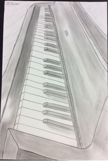
To the left is my linear piece. An important part of making a linear piece look good is finding a good vanishing point. A vanishing point is where all your lines are directed to in one way or another. As you can see, my vanishing point is towards the top middle of my paper. Having a vanishing point makes the picture look realistic and like its coming out of the paper a little. There is alway room for improvement, but for my first piece like this I think I did and ok job. |
|
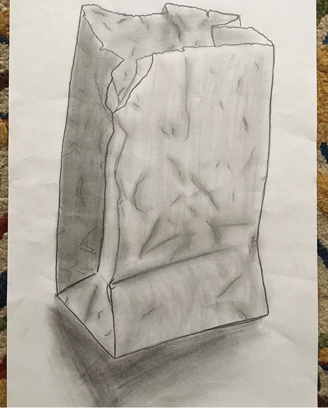
The drawing to the right was a practice. We were practicing basic skills such as shading and blending. I tried to use different values and textures to make the bag look real. At first when my teacher showed my class examples of this assignment I thoughtI wouldn't be able to draw a bag and make it look realistic, but if you take your time and really work hard it will look good. Using lots of different values alone can make something more interesting and realistic. |
|
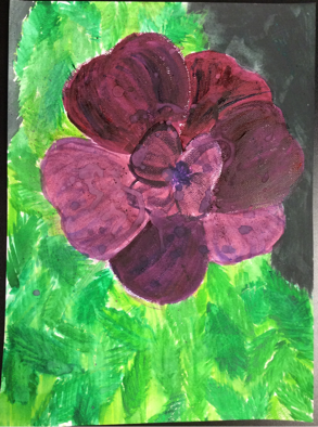
To the right, you can see that piece looks like the one above. I re-painted the flower to try and correct my original painting. I think it looks better because I started out light, then added dark. I also added a bigger variety of colors in the leaves. |
I should've started this water color piece with lighter colors, because now I can't add any lighter colors. The problem with this piece is that there isn't enough variety of colors. But I did work hard on it and tried to be creative. 
|
|
This is my Art in The Park project. We needed to pick our favorite destination in Noblesville. This is undergo the train tracks across the street from Syd' behind Courtney's Kitchen in downtown Noblesville. I love it because it is rustic and cool. It's a real neat place. I tried to show the rusty metal by using a sponge to add texture to the painting. I used my finger to paint the water to try and get a smooth texture in there. This is my first time using power to make paint, and it was difficult getting use to it, but I think this painting was a success.

To the right was a my drawing I made during our eye study. We learned how to start off drawing an eye properly and we learned how to complete it. It takes a lot more than just drawing an oval and some circles. It was interesting to see the different steps we needed to take that we had never taken before to draw eyes.
|
|

In art we photoshopped a picture we had to make the shading different. Then we transferred it onto linoleum, then we used different sized tools to cut into the linoleum. We then printed it onto paper using the ink colors of our choice. I chose to go with black since it was my first cut. You can see where I didn't use enough ink towards the top and on the side. But I do understand the concepts and skills needed for this type of art. 
|

|
This is our nose study. The main point is to add a lot of value from your light source. Value and blending are very important. Towards the middle of the nose I did not blend well enough, but my variety of value is good. |
|
This is my self portrait (clearly from when I was a little girl). But a really important part of the portrait was value. As you can see, there is different kinds of value everywhere. Another important thing to a realistic drawing is no lines. You need to blend them out and use more value and shading. |

|
